We have seen a lot of good and bad elements in websites in the funeral industry. Here we’re sharing with you 4 main mistakes too often made in website redesign, and how to avoid them.
-
Confusing User Interface
User interface, the way that the viewer interacts with a website, is so critical because it can make or break a great experience and even result in lost sales.
 Too many options
Having too many navigation options is very confusing to the viewer. Are you confused when you see this many tabs? Too many options, not knowing where to look, this is frustrating! It’s key to avoid this common mistake.
To remedy this problem, it’s best to take a little time to think through your page offerings. What is the most important. Focus on a few things, and organize the rest.
Useful content below the fold
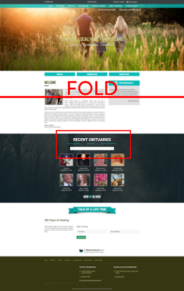
We see this often, especially with obituaries. The “fold” is the visible area that you see on a website, before you have to scroll. The most important information, the most used information, should go above the fold. A common mistake is to put the obituaries below the fold, often times hard to find, yet they are the most viewed part of your site.
As a rule of thumb, the obituaries and the primary options should all be easily found by a visitor with minimal scrolling (or none at all).
Pop Ups
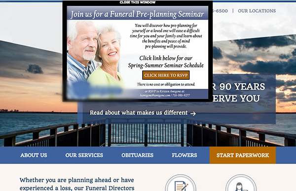 As viewers first visit your site, you want them to see all that’s been thought through and delivered to them. You take time in a redesign to present to viewers what they need, letting them discover what they want, through pages, links, etc. When a pop up cuts into that balanced experience, it’s rarely good. It feels like an advertisement is being shoved in their face at a sensitive moment. See the example above of a pop up that’s taken up the site within the first seconds on the main page. The thought out layout is now cluttered by the pop up, not a great user interface, creating a confusing and furstrating experience.
-
 Distracting and Confusing Visuals
Hard to read text
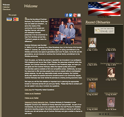
We often see font that is too small to easily read, or text that is so crowded, making it difficult to read even a short paragraph without straining your eyes. In the example to the right, the dark background makes the text very hard to read. This is generally the case with all large text areas where there is a dark background.
 Distasteful photos
We’ve seen more than our fair share of distasteful photos, although most are unintentional. We understand that it’s easy to miss an image that may not work or may have a double sentiment. When choosing images for your new site, pick an example of the actual way your families have chose to honor life through creative, unique services. After all, you’re trying to demonstrate to the visitor how your firm can relate to them on a personal level.
Landing Pages before main page
 We’ve seen landing pages, a loading page before the actual website, jumping ahead of main pages when viewers first visit a website. Although it is intended to offer a welcoming message, it only takes away from the reasons of visiting the site. So many people visit your website to find your phone number, view an obituary, or discover information on planning ahead. Requiring additional clicks to get to their final destination increases the chances they simply bail from your site entirely. This mistake may seem like a good idea for one reason or another, but rarely is a great option.
-
Not mobile friendly
There are two main reasons that your website needs to have a responsive design. A responsive design means your website flexibly adjusts to the size of the device’s screen to offer the best browsing experience. With a responsive design, your site will look great and work effectively on a desktop, tablet, and mobile phone while still retaining the same overall branding.
60% viewers are mobile
The first reason is that more than 60% of viewers are browsing your site from their phone. This number is too large to ignore. You don’t want viewers to have to zoom in and out, scroll horizontally, which will end up in frustration and abandonment.
Google
The second reason to have a responsive design site is Google. In 2015, Google changed it’s algorithm to give preference to sites that are mobile friendly, sites that are responsive. Sites that aren’t will be harder to find in Google searches. Don’t you want to be the first funeral home families find when looking for help?
-
Not having a unique look and feel
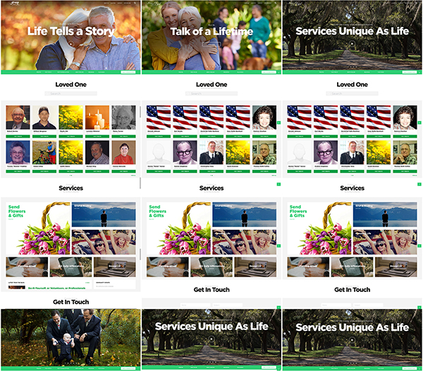 Funeral Directors sell this all the time to the families they serve: unique services for unique individuals. We don’t see you trying to sell a cookie-cutter celebration or service that’s just like all your other services, because you understand that every life is unique and personal, and you promote celebrating a unique life lived.
Why should your website be any different? If you believe that your firm is unique, which we know it is, then shouldn’t your website reflect that? What kind of impression does it make when a visitor comes to your site and it looks just like another firm they visited, and doesn’t reflect your unique message or values?
We see countless websites that look just the same. It’s an easy mistake to make when you’re trying to save money or cut corners, but the damage this does to your brand is critical.
Make a Great First Impression
Your website is often the first, or even only, contact a family has with your firm before deciding whether to become your customer. As a result, it’s critical that your website puts your best foot forward and makes a great first impression.
Make sure your website uniquely reflects your brand, values and services. Want to make sure your website is amazing? Our Social Sites are custom designed to fit your brand, are mobile optimized with responsive design, and are powered by the world’s most effective obituaries. Let’s work together to an memorable experience for your families! Contact us to learn more.

